A COLLECTION OF SERIOUS ART FOR VERY SERIOUS CONSUMERS OF SERIOUS SUBJECT MATTER.
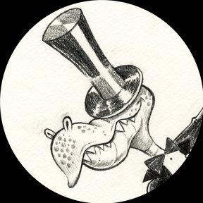
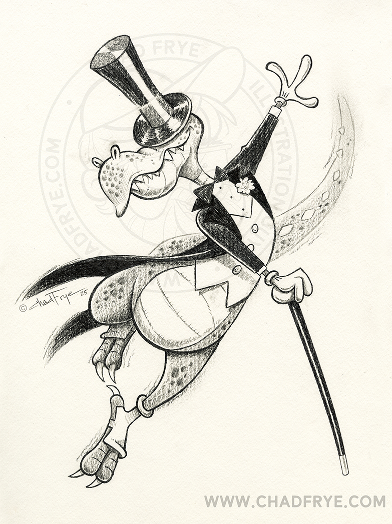

Puttin’ On the Ritz
Graphite
Every now and then, a monster just needs to release his inner Fred Astaire.
Back
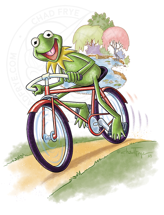

Movin’ Right Along
Digital
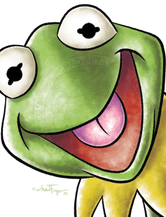
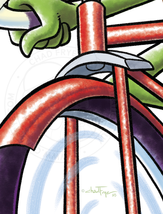
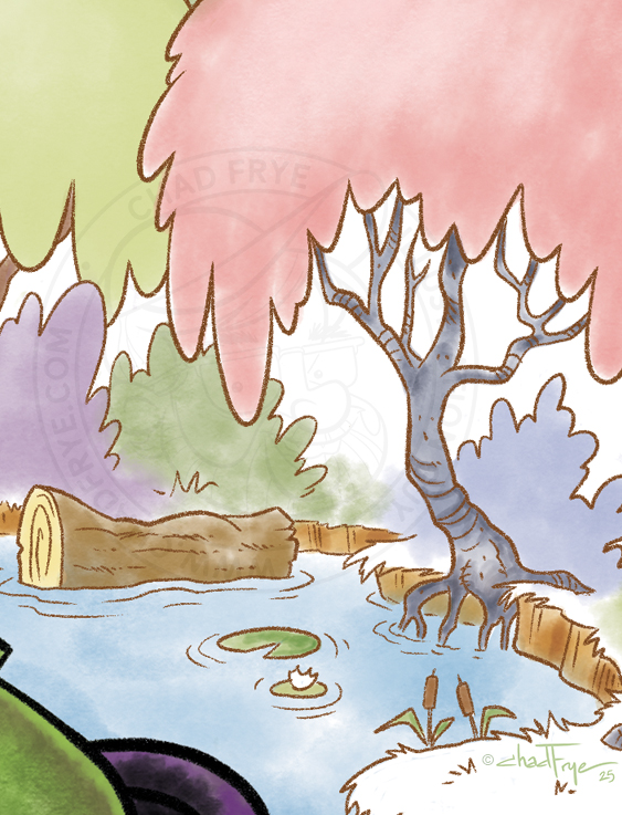
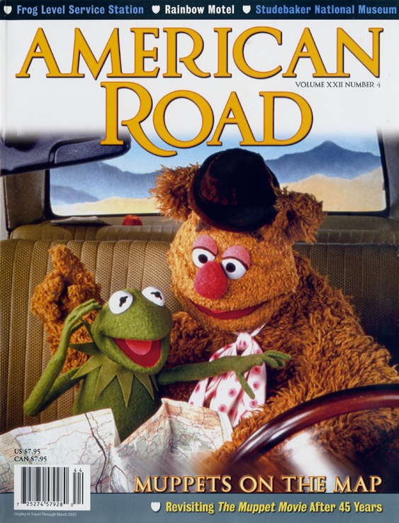
Early in 2025, my friend Tony Craig (who I had worked with at Disney TV Animation years ago) reached out to me to see if I would like to collaborate with him on an illustration for American Road Magazine. The magazine wanted Kermit riding his bicycle for the crossword puzzle page. Tony did a drawing of Kermit, then passed it on to me to work out the rest of it. So, working with the magazine’s art director, I added the background imagery, inked up Kermit, and gave the piece a digital watercoloring job. I didn’t realize until after I received a printed copy that the entire magazine was Muppet-themed which delighted this Muppet fan to no end! I actually tried to work for the Jim Henson Company before I ever got into animation long ago. It only took thirty-four years into my career to finally have my first Muppet gig!
Back

Paddington 2
Colored Pencil
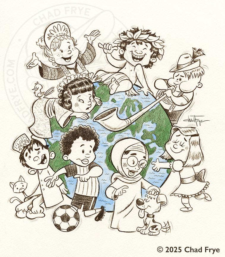
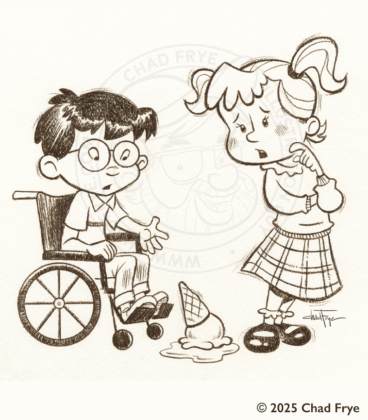
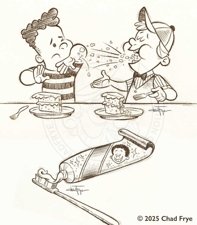
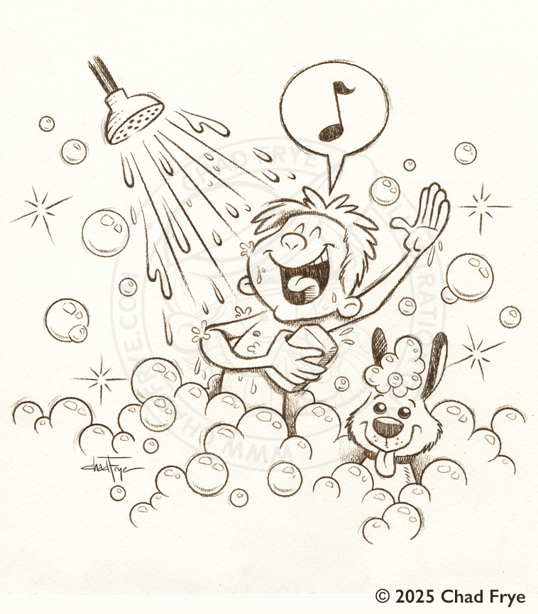
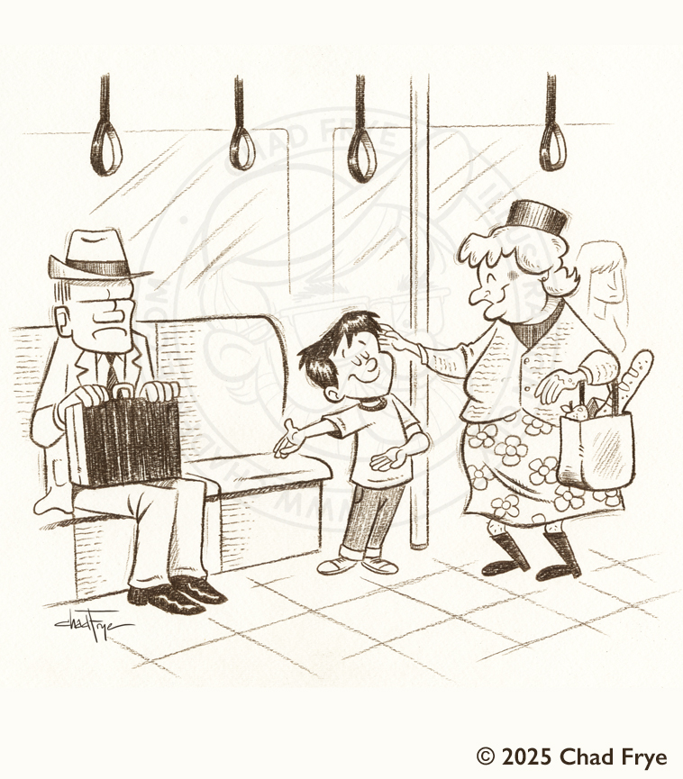
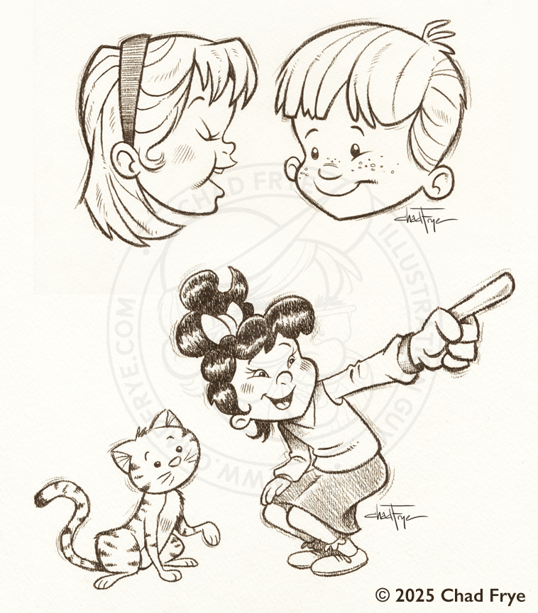
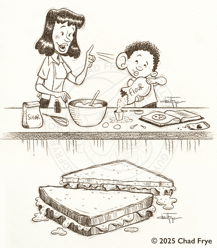
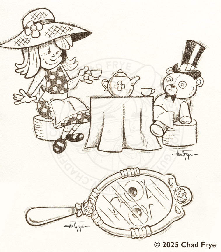
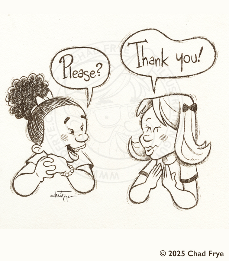
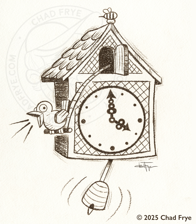
One day the producer of the special features for the Paddington 2 Blu-ray reached out with an interesting proposal. He was putting together a short video that contained interviews with the cast of the movie where they were talking about the rules of etiquette that Paddington’s Aunt Lucy might have tried to instill in her charge. He wanted me to do a series of pencil drawings in my own style that would appear on pages of an etiquette book as they flipped from one politeness tip to another, interspersed with clips of the cast. I absolutely adored those first two Paddington movies, and was excited to be a part of the Blu-ray. Alas, as the way some things happen in Hollywood, that featurette didn’t make the cut on the Blu-ray, but I have been allowed to share the art nonetheless.
Back

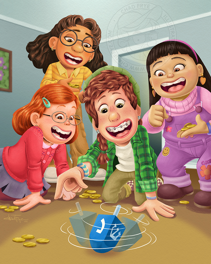
Pixar Holidays
digital
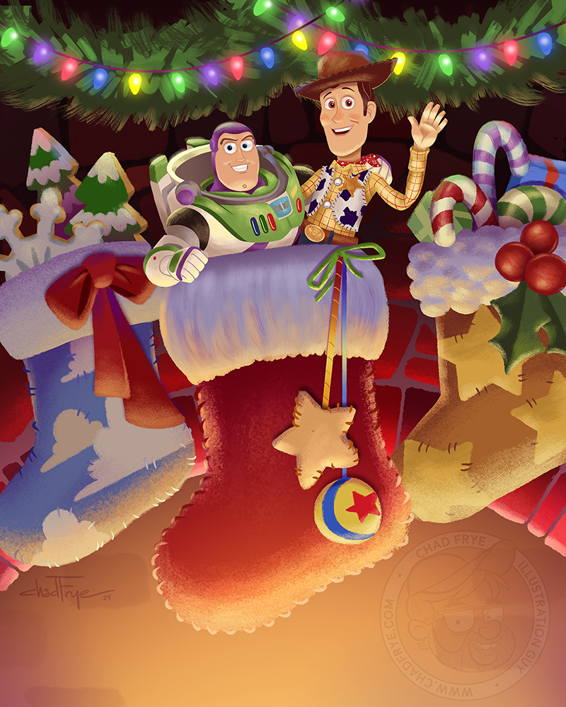
What a treat to get to officially illustrate Woody and Buzz Lightyear again for Pixar, after having last illustrated a few children’s activity books for them back when the first Toy Story came out in 1995. This new Toy Story piece was used as Pixar’s official social media post on Christmas day in 2024. It was penciled by my friend Liz Masters, and then painted by yours truly. The ad agency I worked for had someone else animate some motion into the image for the final post.
That same agency also had me create from scratch the Hanukkah illustration that featured the four girls from Pixar’s Turning Red movie that was posted on Pixar’s social accounts for 2024’s Hanukkah. “Dreidel, dreidel, dreidel….”
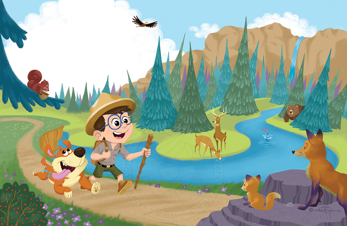

Nature Walk
Digital
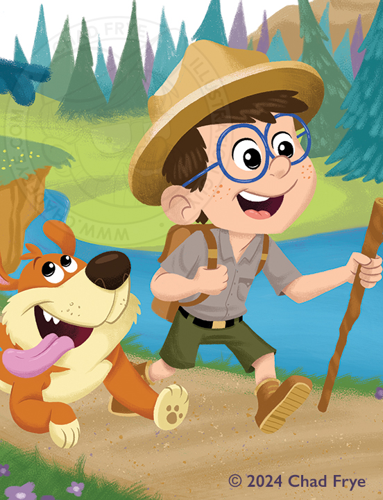
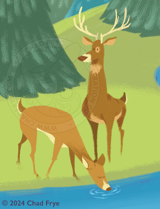
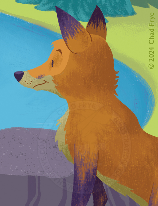
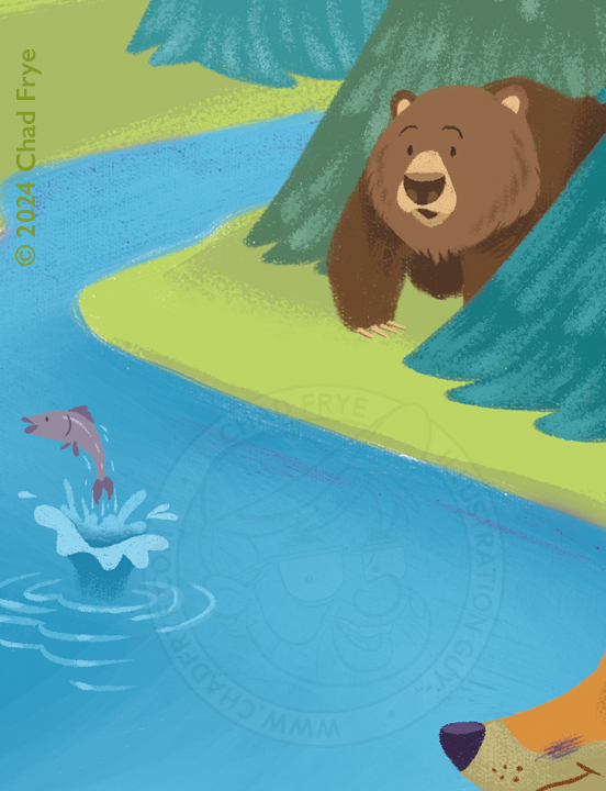
This was an exercise to draw and paint something in a style I had not done before. It has a bit more of a retro Golden Book kind of look, similar to something maybe illustrator Mel Crawford might have done. I even left room for story text to be placed in that giant cloud as if this was a spread for a children’s book. So, since it was an exercise for me, it seemed apropros that the main figures should also be exercising.
Back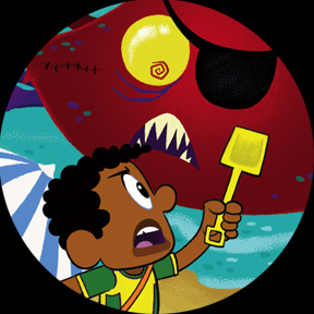
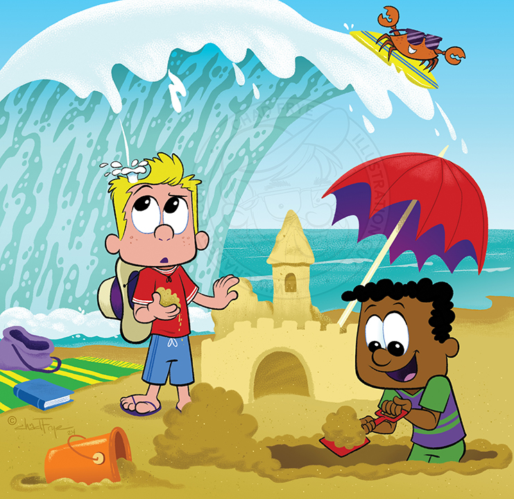

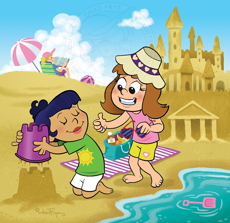
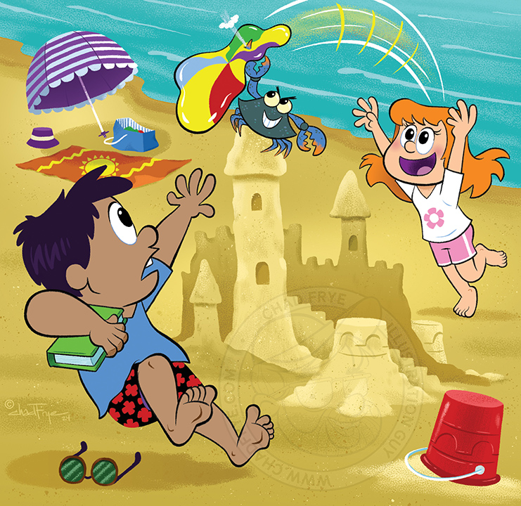
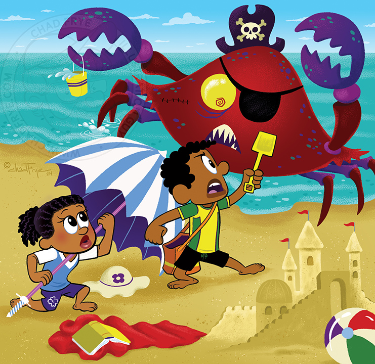
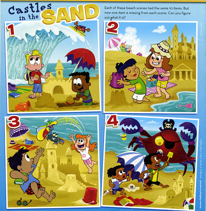
Castles in the Sand
Digital
It’s always fun when Clubhouse Magazine comes calling, because it’s always a fun project with them. The instructions for this one were to include two kids in each picture along with 9 specific items in each beach image. From there, they let me embellish the scenarios with my imagination. The idea is that there are ten items total that SHOULD be in each pic, but by studying all four images, you would need to identify which item is missing from each image. Tough, especially when they don’t supply a list of what should be there! These illustrations appear on the back cover of the July, 2024 issue.
Back

Disney Holidays
Digital
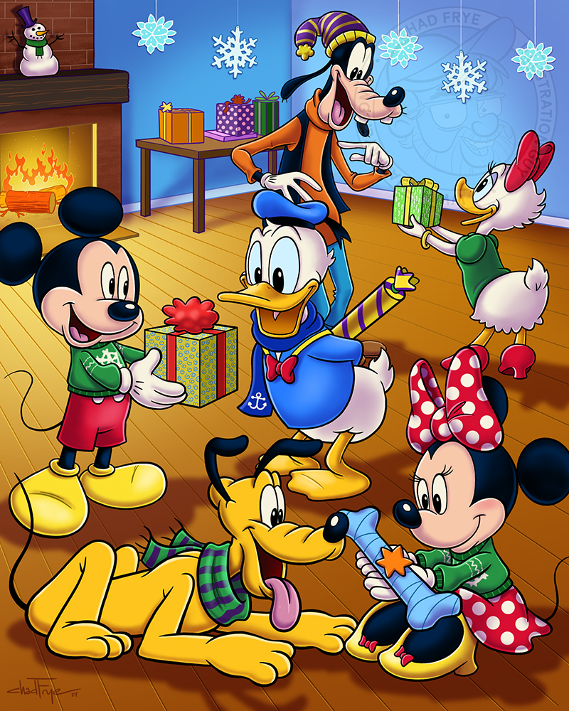
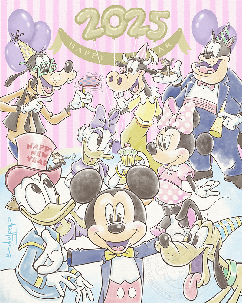
In November of 2024, an advertising agency hired me to create some custom holiday themed illustrations to be used on Disney’s social media accounts. It was a real treat to get to officially draw Mickey and the gang again after having last drawn them for Disney television years before. The art director wanted a gift giving themed piece in full brilliant color that was posted to both Mickey and Minnie’s personal accounts a few days before Christmas that year, and they wanted ten characters in a pastel watercolor look for New Year’s day that they animated as a countdown revealing each character as voices counted down from 10 to 1.
After these had been posted, I saw some fan comments expressing their disappointment that Disney was posting images created by AI, which came as a surprise to me. I assure you, these were hand drawn and colored by me! No AI was used – just regular ol’ I.
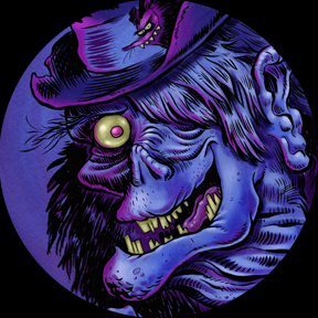
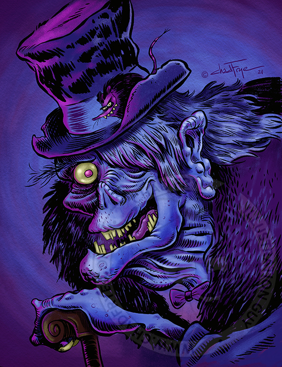

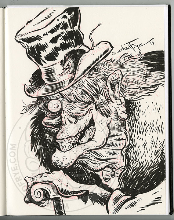
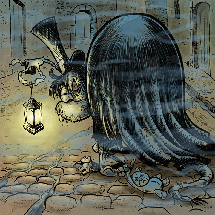
Hideous Creatures
Ink & Digital
These are a pair of monsters cut from the same cloth, so are being posted together. The first hideous creature started as a traditionally inked drawing in my sketchbook that was colored digitally a couple years later to a sufficiently creepy effect. Don’t let the smile fool you – he’s not that friendly.
The second in sepia and blue was my imagination pondering what might have been roaming the midnight cobblestone streets of London back in the day, putting fear into the hearts of children. I thought the teddy bear was a nice touch.

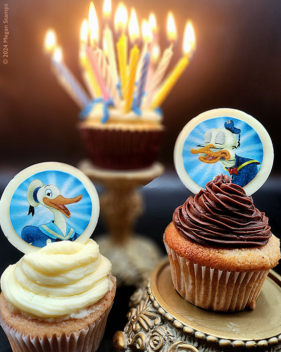
Donald Duck at 90
Digital
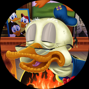
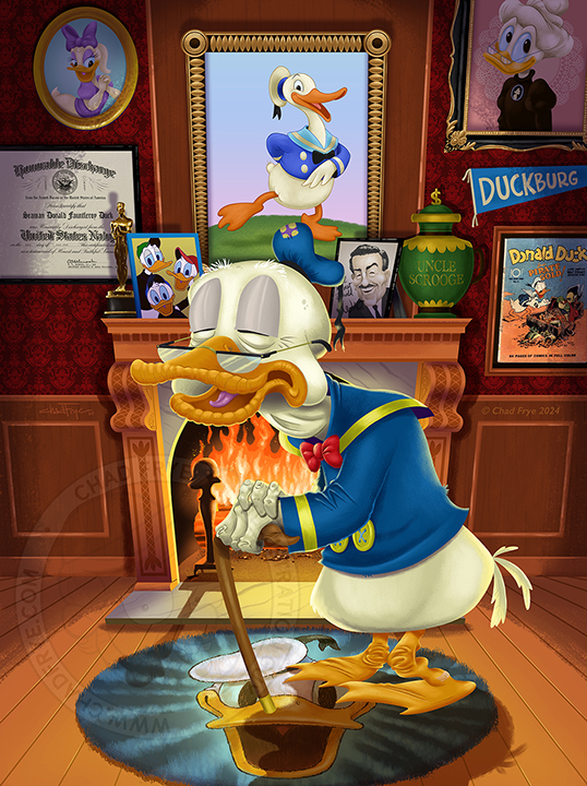
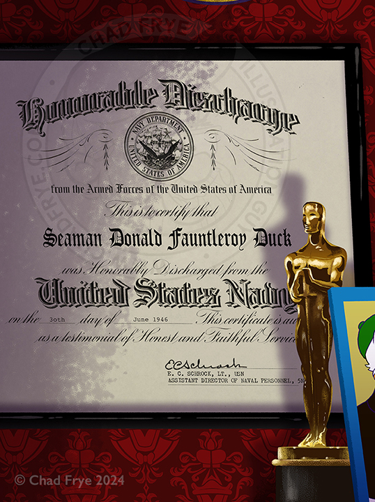
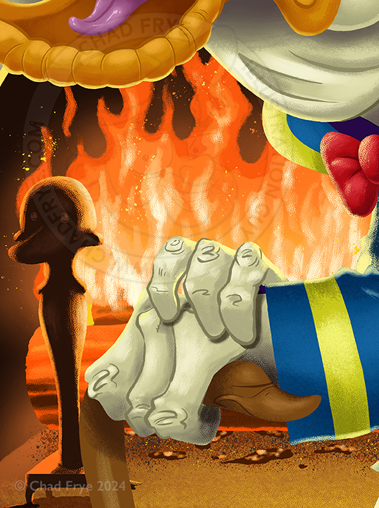
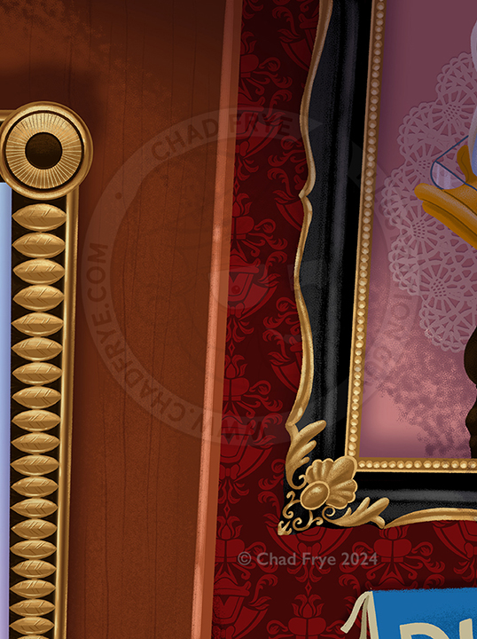
The Duck turned 90 on June 9, 2024!! With his temper, you’d think he would have stroked out by now. June 9, 1934, Donald Duck made his first appearance in the short film “The Wise Hen.” He’s been squawking unintelligibly ever since. And somehow, he still hasn’t figured out how to wear pants.
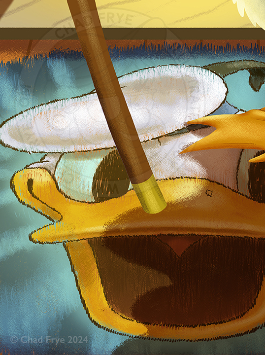
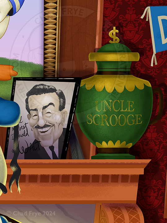
I created this piece showing an age-appropriate Donald, with mementos from his life surrounding him. Everything was painted digitally, with just three collage items included: the honorable discharge document which was altered a little, Grandma Duck’s doily, and the cover of Donald’s first comic book.
The last picture is a collaboration with my sister who has a baking business in the suburbs of Houston, TX, called Dessert 1st. I prepped the images, and she turned them into edible sweets!

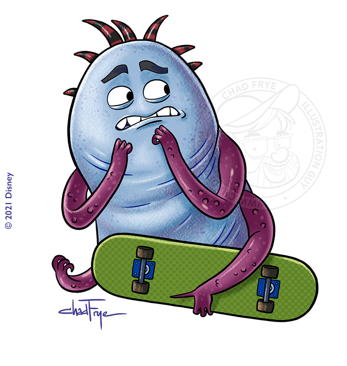
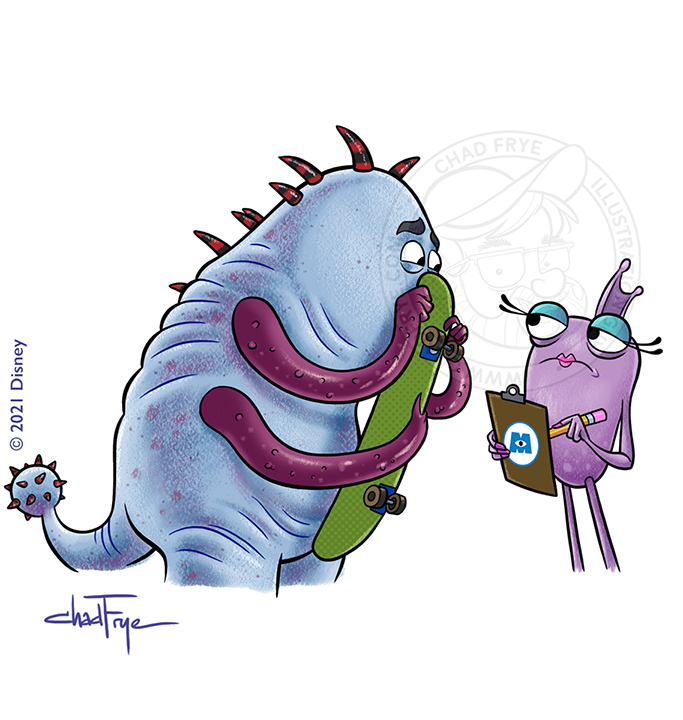
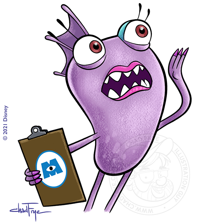
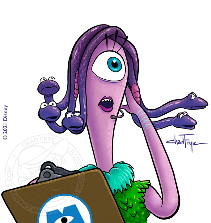
Monsters At Work
Digital
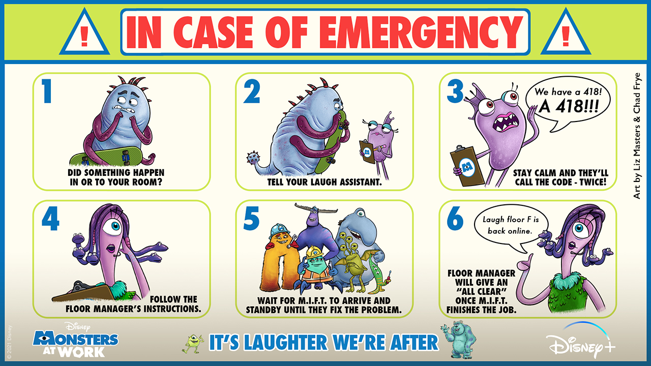
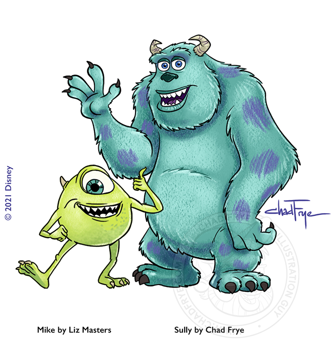
Sometimes a project comes along requiring a bit of teamwork. My friend Liz Masters was creating this ad for Disney’s Monsters At Work series when she had something more pressing call her away. So, I stepped in to finish for her. She had already painted a few characters (Mike Wazowski, and the left three monsters in the six member group image), and designed the layout, so I stepped in to illustrate the rest of the creatures and made adjustments to the layout as per the ad agency’s notes. Voila! Teamwork!
Back


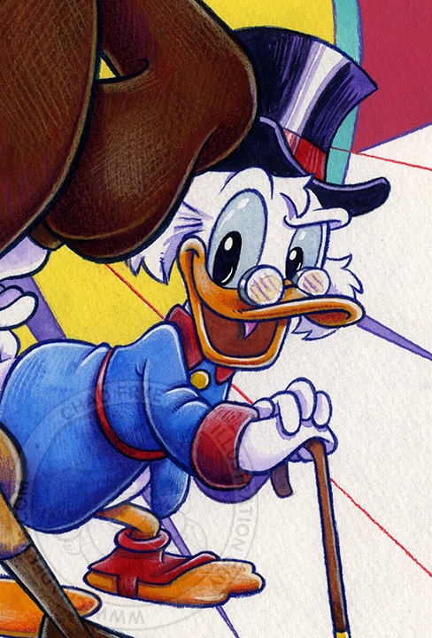
Launchpad
watercolor, gouache & colored pencil
As a character originally created to be Scrooge McDuck’s traveling companion on his adventures in the TV show DuckTales, I was always intrigued that Launchpad McQuack made the leap to be a sidekick to Darkwing Duck as well. This piece was created for a time when I was a guest at a Disney-themed convention that was also being attended by Terry McGovern, the voice of Launchpad in the original series DuckTales and Darkwing Duck.
Back
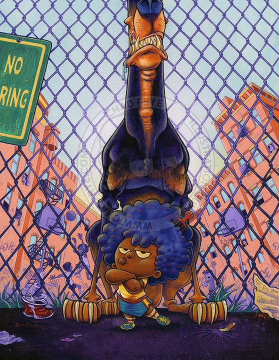

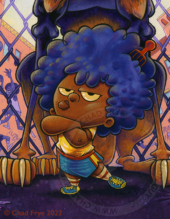
Fierce
watercolor, gouache & colored pencil
I’m always intrigued by the little guy who acts tough – a Napoleon complex if you will. This piece started as just a random pencil sketch in my sketchbook, and as soon as I saw the kid with the Doberman on the page without a background, I stopped sketching. This HAD to be a painting. Combined with the interest in the main subjects, and a crazy desire to take on the challenge of drawing and painting a chain link fence, this piece was born.
Back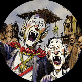




Coloring Jack Davis
Digital
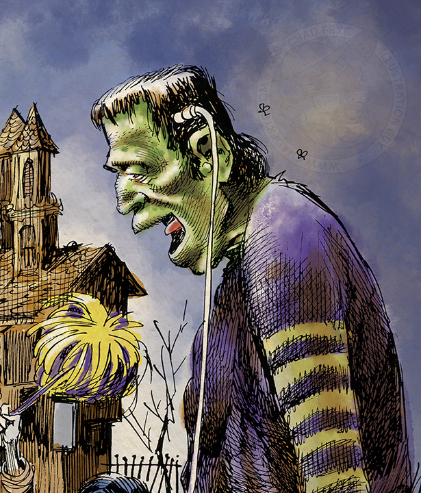
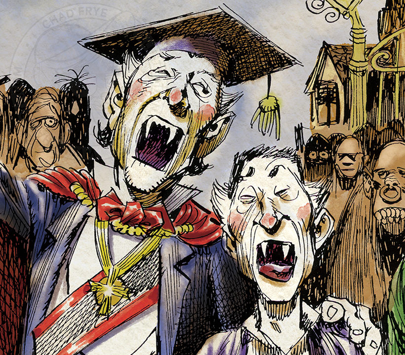
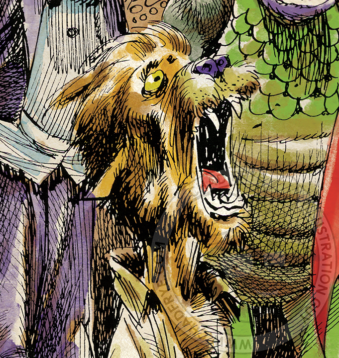
I was privileged to be asked by Grant Geissman and Roger Hill to paint a previously unpublished monster drawing by the late great Jack Davis that was published on the back cover of their November 2023 issue of EC Fan-Addict Fanzine. This was to be a record album cover back in the day, but for whatever reason, this image was abandoned, so Jack never saw it through to final watercolor.
To try to imitate Jack’s very unique watercolor painting style was a daunting task, especially while doing it digitally and not with traditional materials. Not only that, but while Jack is one of my art heroes, he was also a pal. I wanted to do him proud as if he had personally asked me to paint it for him.
So, I pulled up lots of his monster paintings online, and pulled out a few originals I have in an attempt to immerse myself with his painterly approach. Hopefully he would have been pleased with the effort, as I hope his fans are when they see this.

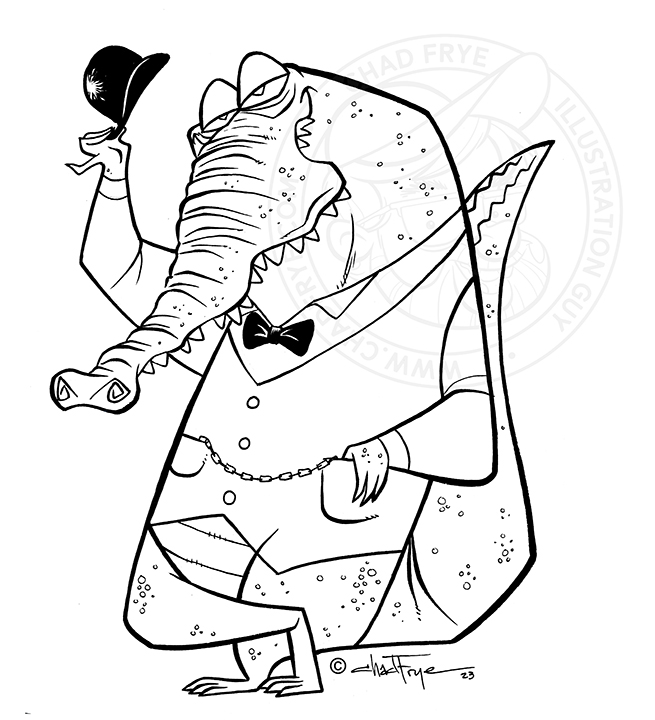
Dappergator
Digital & Ink
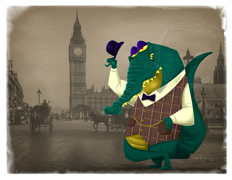
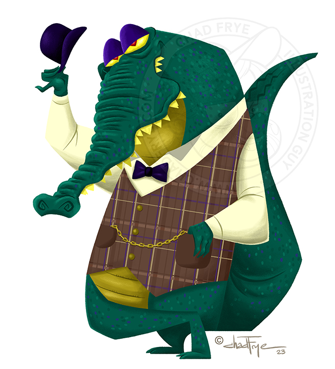
You never knew what kind of shady characters you might have met on the foggy streets of ye olde London.
Dappergator started as an inked drawing in my sketchbook after which I decided to recreate him digitally with a mostly lineless look in color, adding in an old timey photo of London which I also edited a bit. He may be dapper, but believe me, he knows how to use those teeth.
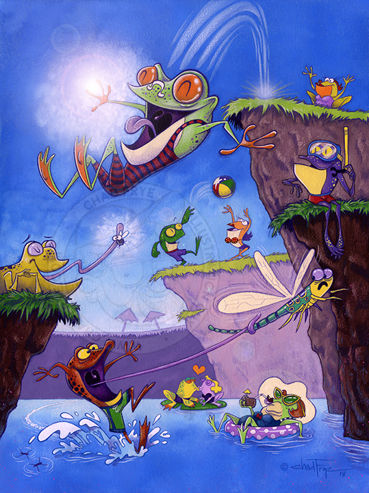


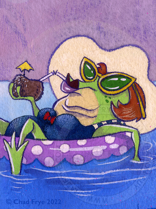
Leap Frogs
Watercolor, Gouache, Colored Pencil & Digital
What is more summer-ful than frogs enjoying life in their natural habitat – the ol’ swimmin’ hole? Just a fun piece inspired by a series of sketches from my sketchbook. You never know what inspiration can come from random doodles on a blank piece of paper. Well, NOW I guess you know, but before this, you had no idea.
Back

Frankenlisa
Watercolor & colored pencil
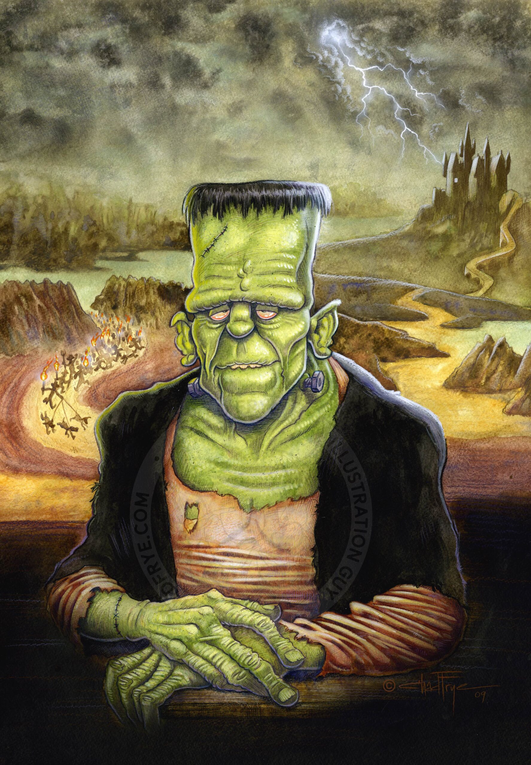
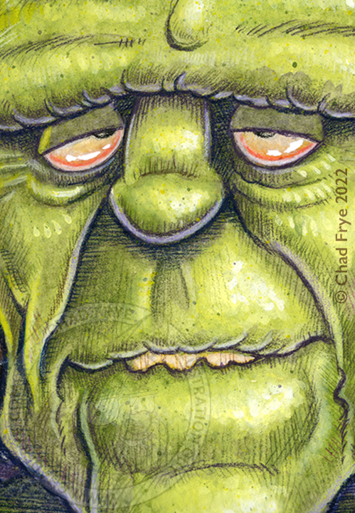
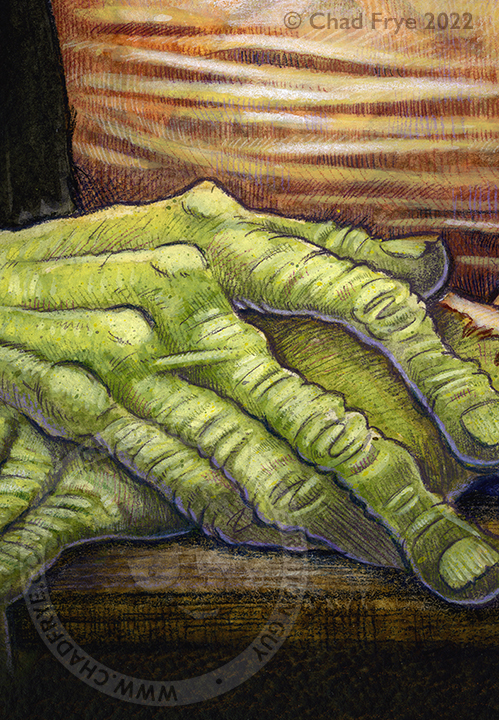
This is perhaps my favorite piece I ever did. I had been working on lots of pre-school animation projects for television at the time, so maybe a way to decompress at home was to combine Leonardo da Vinci’s Mona Lisa with Frankenstein’s monster. It certainly was a big challenge to paint in a way I had not before, but that’s what personal projects should do, right? They need to make one a better artist. I wrote extensively on my blog about the step-by-step process of creating my own monster. Unlike Dr. Frankenstein, the only electricity used this time was for my lamp and pencil sharpener. CLICK HERE to go to Part 1.
Back


Summer Boredom
Watercolor & colored pencil
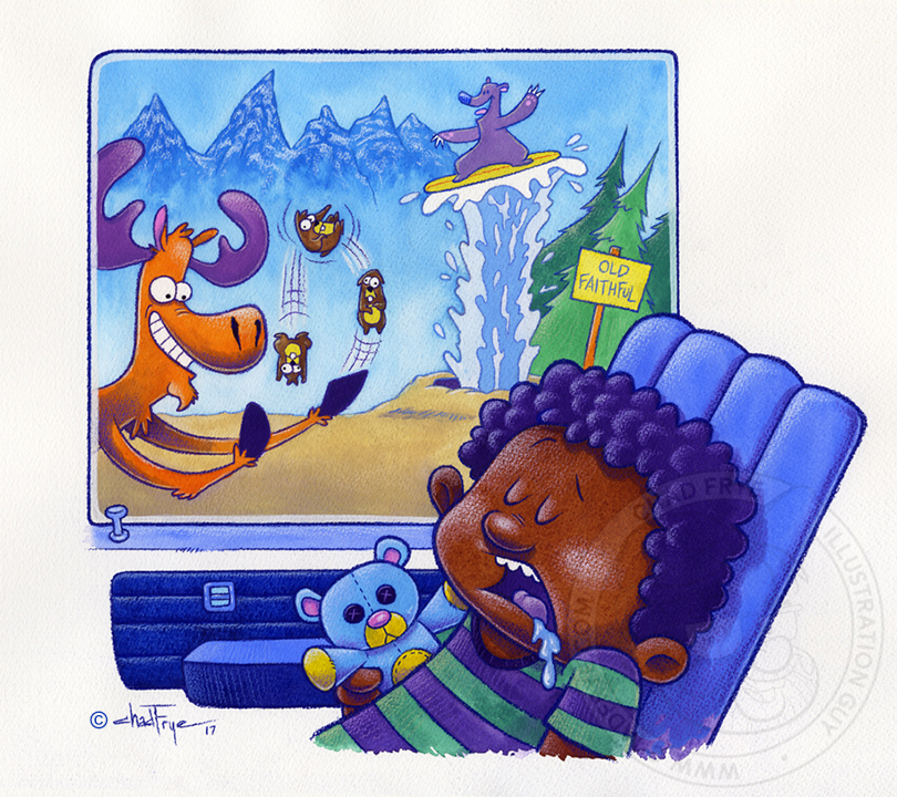
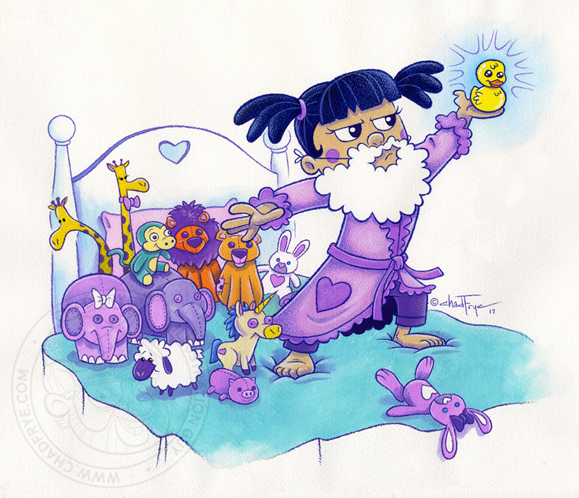
These spot illustrations were created for an article about summer boredom in children’s publication Clubhouse Magazine published by Focus on the Family. One boy was napping on a road trip missing all the exciting things out of his car window, a girl pretending to be Noah with her stuffed animals on her bed, and a third kid was writing about how he imagined his life as a lobster, but kept breaking the pencil with his claw. It was a super fun assignment that I hope put some smiles on kids’ faces as much as I was smiling when I thought of a moose juggling prairie dogs.
Back
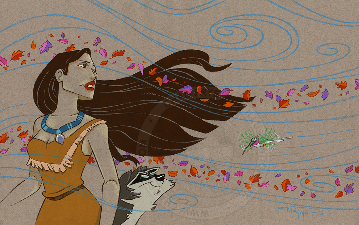

Pocahontas
Gouache & Colored Pencil
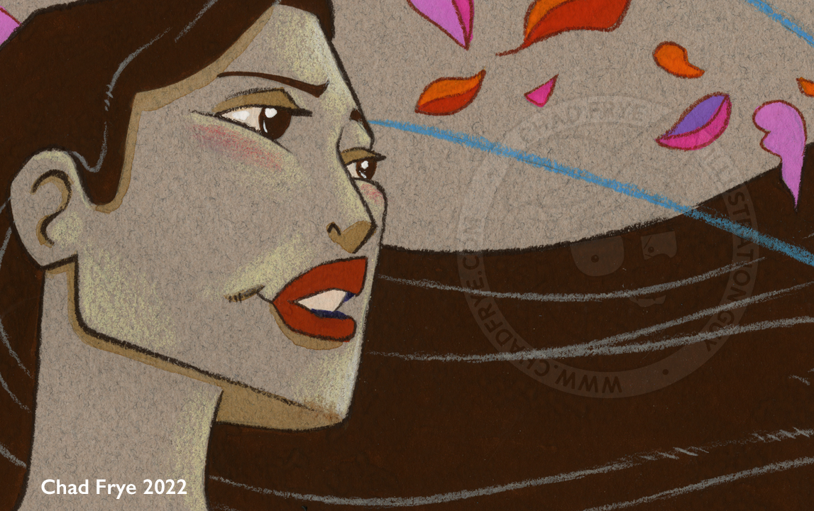
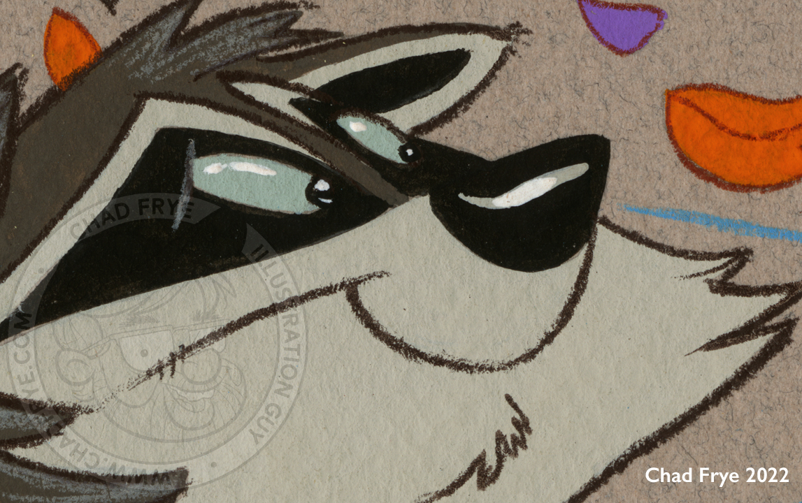
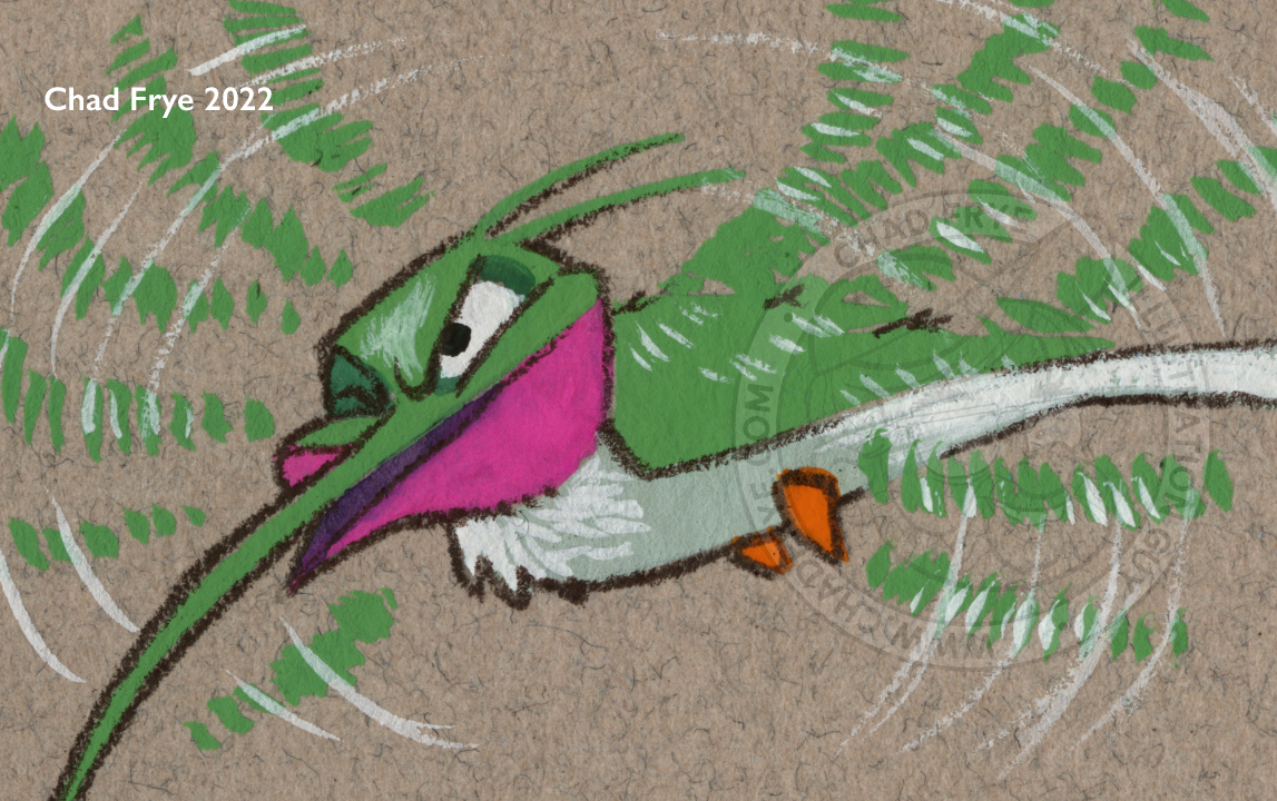
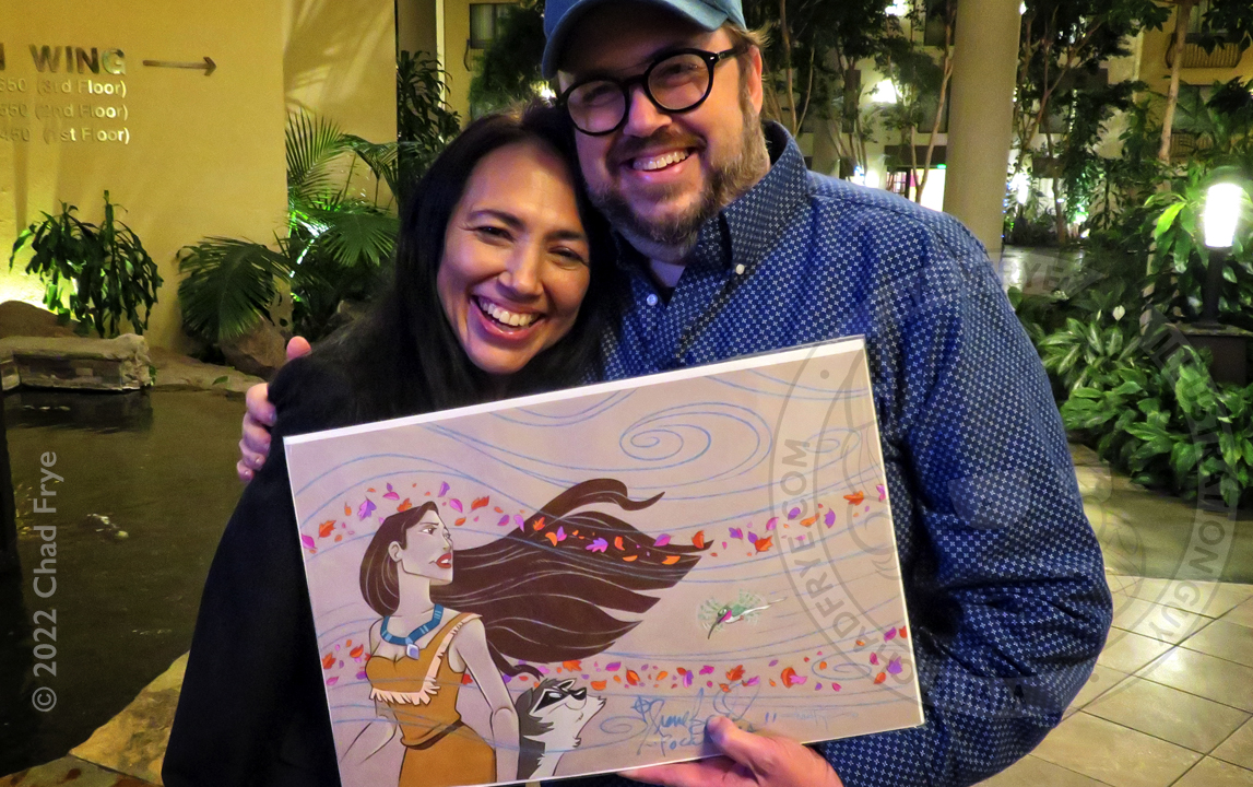
This was a private commission created for the man who started MouseCon, a convention for Disney fans that has annual gatherings in Bakersfield, CA, Concord, CA, and Salt Lake City, UT. While I did not work on Disney’s Pocahontas movie (I started at the studio just as Hercules was being released), I took on the challenge of illustrating Pocahontas with her pals Meeko the raccoon and Flit the hummingbird, with leaves blowing reminiscent of the song Colors of the Wind. With my Disney Animation past, he had invited me to be a guest at his convention in Concord, CA, where the voice of Pocahontas herself, Irene Bedard, was present!
Back


Arbor Day
Watercolor & colored pencil
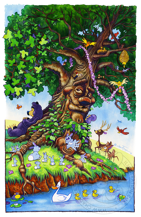
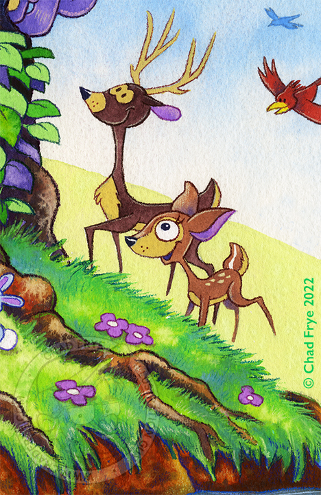
Each year I create my own Christmas card. Every now and then I like to shake things up by skipping Christmas, but surprising folks with a card for a holiday on which no one ever sends cards. One year Arbor Day was chosen. This image graced the front of the card with a beautiful verse about the majesty of trees. On the inside was a line drawing showing how that tree had been made into that year’s card.
Back


SILA Poster
Watercolor, gouache, colored pencil & digital
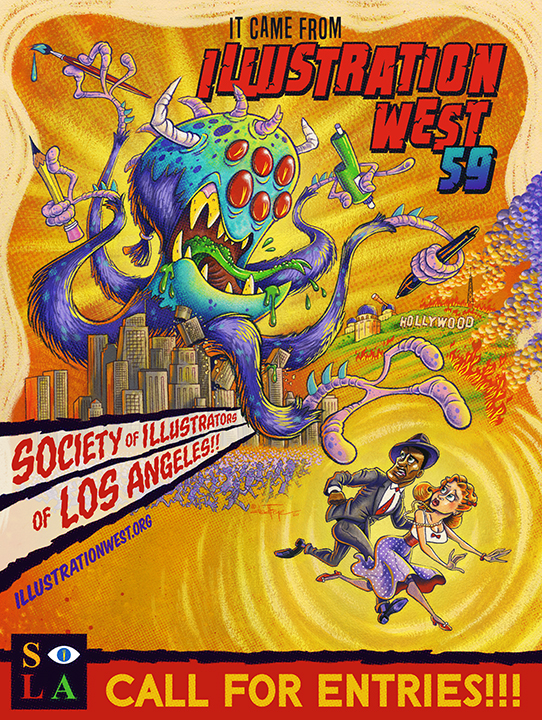
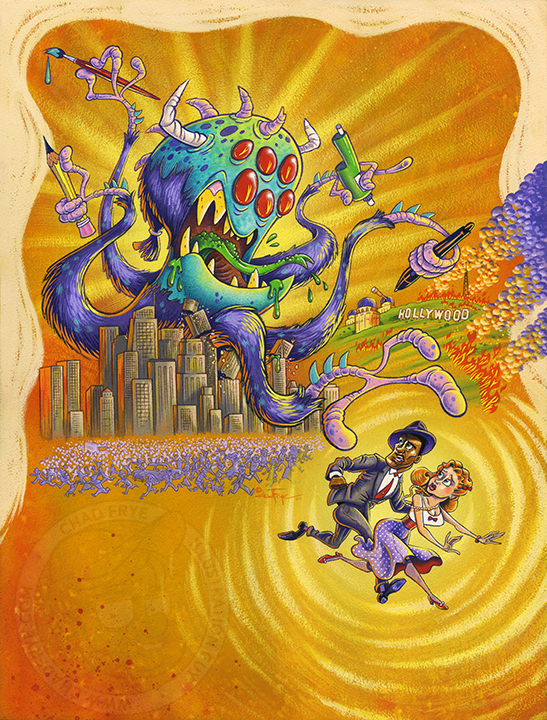
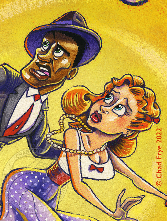
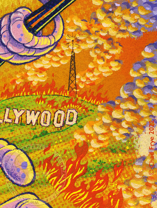
In 2020, the Society of Illustrators of Los Angeles (SILA) asked me to chair their annual art competition called Illustration West. It was the 59th year they hosted this competition for professional and student illustrators from around the world. So, I put together a stellar jury of industry professionals, and made it happen. I was also asked to personally create the poster that would advertise the call for entries which was a huge honor (which means it was intimidating).
Since the contest is in Los Angeles, I wanted the poster to reflect that. And to make it fun and exciting to me, I looked to the creature feature posters of the 1950s for inspiration. While I did the painting, I called upon my buddy Andy Heckathorne to design the text. After laying in the text, I did some digital finagling to give the overall piece a hint of printing dots that were more common back in the 1950s printing technology.
I wrote a 7-part step-by-step of the creation on my blog which you can read by
CLICKING HERE.

The Swimmer
Digital
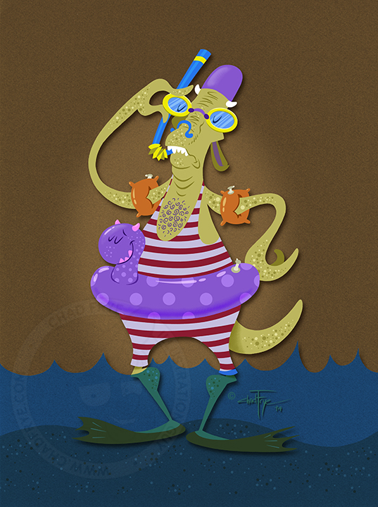
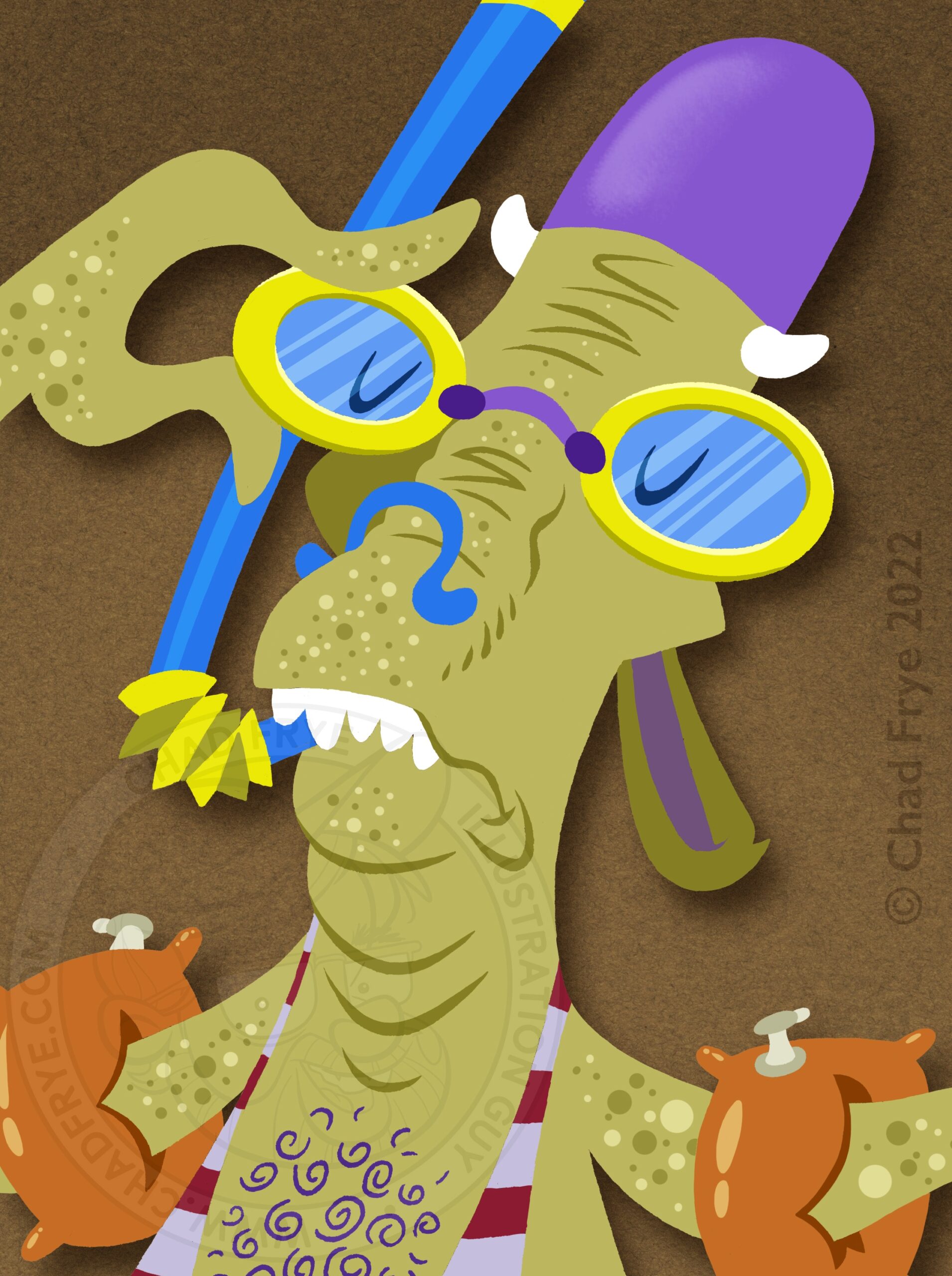
Many times over the years, I will post on social media and my blog a monster a day during the month of October. Monster Month, as I call it, has been fun for the character designer in me to come up with fun images whether as simple as a sketch, or as finished as an illustration. This is one of the latter, created in Photoshop, with real paper texture scanned in to ground it in the physical world. Also, it’s nice to know that monsters can have a healthy fear of the water. Safety first!
Back
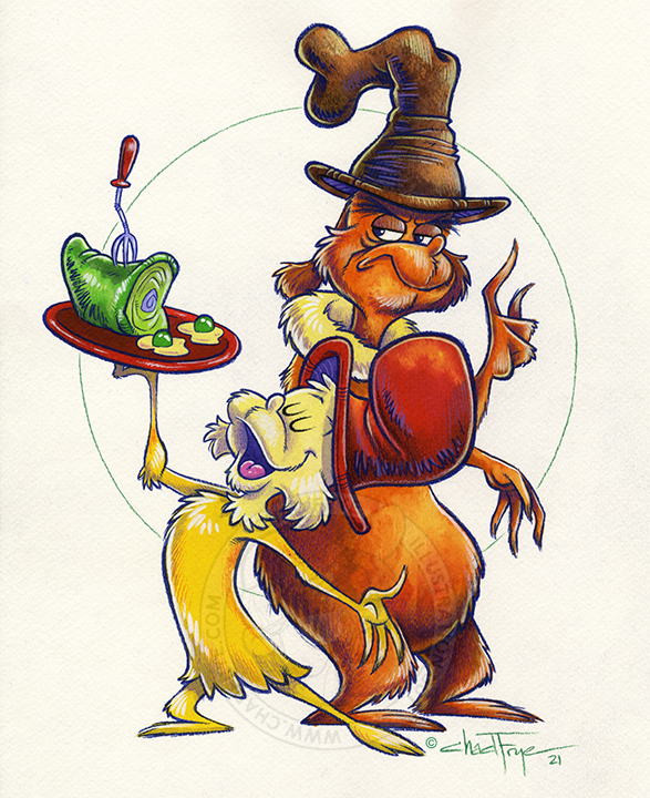

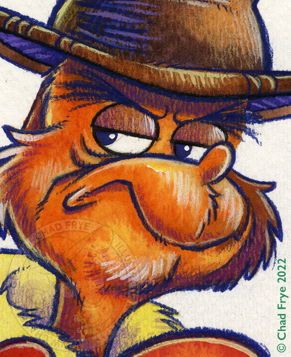
Green Eggs & Ham
Watercolor & colored pencil
I was pleased to be a part of the storyboard team on the second season of Netflix’s Green Eggs & Ham series. As a series, it extended the adventures of Sam I Am (voiced by Adam Devine), and gave a name to his grumpy companion that Dr. Seuss did not name – Guy Am I (voiced by Michael Douglas). I continue to enjoy drawing Sam and Guy for fans in sketches and the occasional watercolor piece. This remains the most liked image I ever posted on my Instagram page, and I enjoy it so much, too, that the original remains on display in my studio.
Back
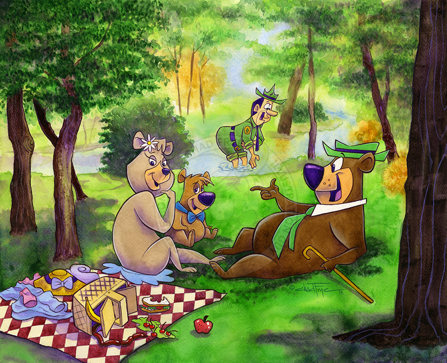

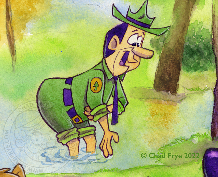
Pic-a-nic on the Grass
Watercolor & colored pencil
Created for a Hanna-Barbera themed art show at a Los Angeles gallery, Pic-a-nic on the Grass is a direct parody of Èdouard Manet’s famous Luncheon on the Grass that was all the rage in good ol’ 1863. The paintings are 150 years apart, but both meals probably had ant problems.
Back
